A friend at a SaaS startup asked me to help make their design system work with AI tools. I said yes because I wanted to learn how. What I learned changed how I build my own website.
This is the story of that project: how auditing someone else’s component library taught me what tokens actually do, how I ended up rebuilding my portfolio from scratch with tools I’d never used, and what a design system looks like when the designer is also the developer and the AI is the third collaborator at the table.
The audit that started everything
The project sounded straightforward. My friend’s company had a Figma design system. Hundreds of components, color styles, type styles, spacing values. It worked for human designers. The question was whether it could work for AI agents generating code.
I started with one component: their Badge. Twelve variants across Pill color and Badge modern styles, three sizes, eight icon configurations. I opened the Figma file with view-only access (no Dev Mode) and began documenting what I found by hand.
Each Badge variant used three separate color Styles working together. The Blue Badge, for example:
Background: Primary/50 at #EFF8FF. Border: Primary/200 at #B2DDFF. Text: Primary/700 at #175CD3.
Three Styles per variant. Twelve variants. That’s 36 individual Styles for one component. Every one of them was a Figma Style, not a Variable, which meant each value was hardwired. No dark mode. No way to switch themes without manually reassigning each Style on every component.
The pattern held across every color variant: 50 for background, 200 for border, 700 for text. Once I saw that pattern, the rest of the audit became mechanical.
What I delivered
I built a proof-of-concept that connected three things: the Figma component, the code, and the documentation.
In Figma, I rebuilt the Badge using Variables instead of Styles. The original had 36 hardwired Styles across 12 color variants (three per variant: background, border, text). I replaced those with three semantic Variables that resolve per mode:
color/badge/background · color/badge/border · color/badge/text
Each Variable has a light value and a dark value. Thirty-six hardwired Styles became 3 Variables × 2 modes = 6 values to maintain. One component now handles all twelve colors in both light and dark.
From the side properties panel, a designer can swap a Badge instance to any color variant (switch to “success,” for example) and rename the label inline. The original file didn’t allow either. I also set up a Variables-mode test: select a Badge instance, toggle between light and dark from the appearance panel, and see it update live. To make the improvement visible, I built a side-by-side comparison in the same file: the original hard-coded Style version on top, the new Variable-based component below.
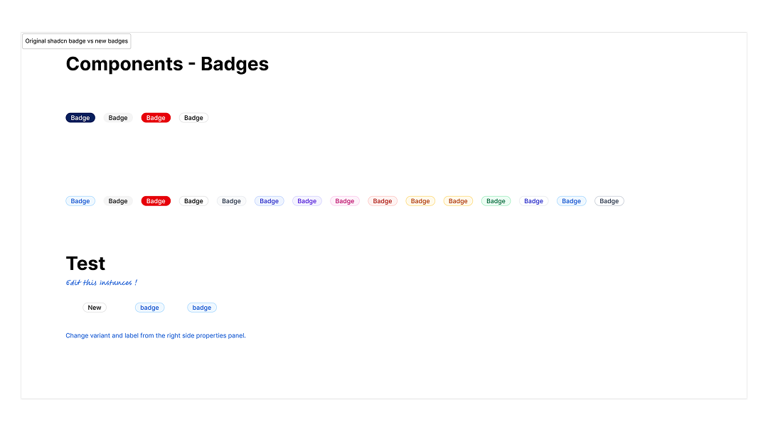
In code, I implemented all 12 variants using shadcn/ui and Tailwind CSS. Shadcn ships four default Badge variants: default, secondary, destructive, and outline. I remapped these to match the client’s system: default became Gray, secondary became Blue, destructive became Error, outline became Badge modern. Then I added eight custom variants to cover the rest of their palette. Twenty-six color variables, defined once in CSS, referenced by both the code and the Figma Variables. The token name stays the same at every step:
Figma Variable (color/primary/50) → CSS custom property (--color-primary-50) → Tailwind token (bg-primary-50) → shadcn component
The documentation was a live website deployed at a URL he could share with his team. The main page shows all 12 Badge variants rendered in production code, each labeled with the exact token names from their Figma file so the values can be verified side by side. A deeper documentation page walks through the token structure, notes which variants are duplicates (Orange is identical to Warning; Blue light is identical to Blue), and flags what’s missing (dark mode, the Styles-to-Variables migration).
A few things I noticed during the audit that shaped the proposal: the system used Figma Styles for everything, not Variables. Interactions like hover timing and transitions weren’t documented. Dark mode didn’t exist. I scoped these as follow-up phases and asked whether dark mode was a current requirement or future work.
My friend’s response confirmed the approach was right. He shared the Figma file with his engineer and said the proof-of-concept “perfectly represents the desired outcome” for the rest of the project.
The badge proof shipped: Figma component with Variables, coded variants, live documentation. The system-wide migration, applying the same Variable architecture to every component in their library, didn’t move forward. Scope, timing, the usual reasons projects stall. But the badge work had already done something I didn’t expect: it taught me to see design systems as token architecture, not component libraries. And it taught me that the gap between Figma and code isn’t a tooling problem. It’s a naming problem. When the token name is the same at every layer, the system is already ready for AI or any other collaborator that reads names instead of looking at swatches.
→ See the badge component audit
Rebuilding from scratch
Around the same time, I was rebuilding my portfolio. I’d been using Framer, and it did what I needed, but I wanted to build something I could own completely. Something I could extend with code, deploy on my own infrastructure, and use as a testbed for the experiments I was starting to run.
I chose Astro. Static-first, fast, and built around the idea that most pages don’t need JavaScript. For the components, I started with shadcn/ui because that’s what I’d been using on the client project. But shadcn is React. My site didn’t need React. It didn’t need a virtual DOM, a bundler pipeline, or the overhead of a JavaScript framework just to render a card with a heading and some text.
I found Basis UI instead. It’s the same idea as shadcn, copy-paste components built on CSS variables, but for Astro and Alpine.js. Same token conventions. Same --primary, --secondary, --accent naming. Different runtime: Alpine.js is 15KB, declarative, no build step. The components are Astro files I can read, understand, and modify without a framework getting in the way.
The pivot felt right immediately. I wasn’t building a web application. I was building a portfolio that reads like a magazine and grows as I add experiments. Astro’s file-based routing means adding a page is creating a file. Alpine.js means interactivity is an HTML attribute, not a component tree. Basis UI means the design tokens are CSS variables that I define once and everything inherits.
The tokens I actually built
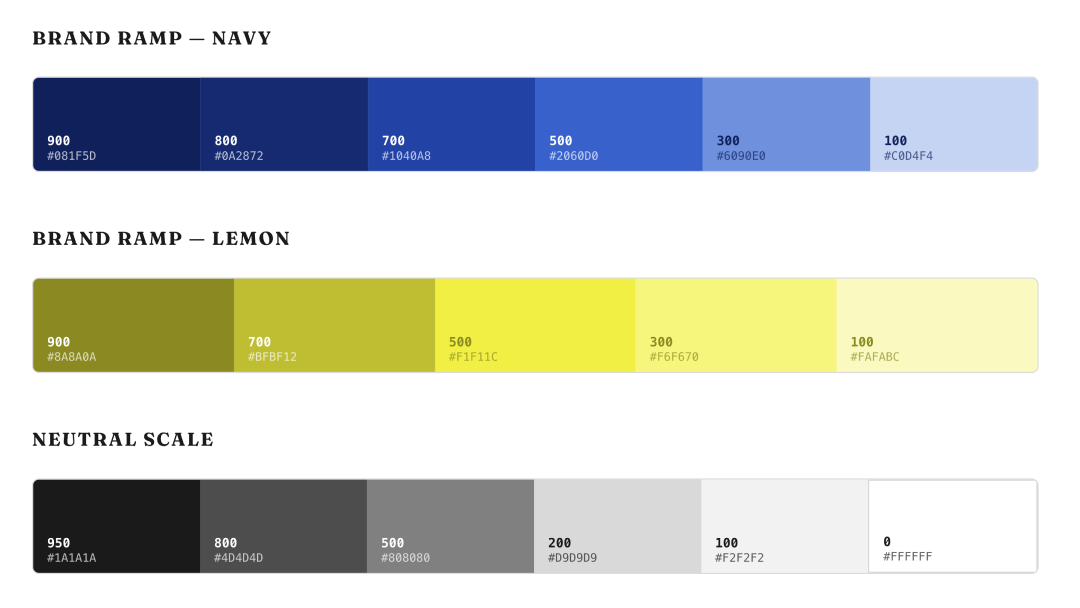
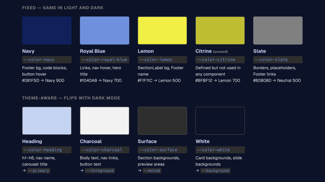
My color system has two brand colors: Deep Navy (#081F5D) and Lemon Sorbet (#F1F11C). Every other color in the system is derived from one of these two plus a neutral gray scale.
I defined them as HSL values without the hsl() wrapper, following the shadcn convention that Basis UI inherits. The reason is composability: Tailwind can add opacity modifiers to bare HSL values. bg-primary/50 works because --primary is 223.8 84.2% 19.8%, not hsl(223.8, 84.2%, 19.8%). That small formatting choice makes the entire system work with Tailwind’s utility classes.
The token architecture has three layers. The brand ramps sit at the bottom: six Navy stops from 100 to 900, five Lemon stops from 100 to 900, and a neutral scale. Above those, semantic tokens map to roles: --primary, --accent, --background, --foreground, --muted, --border. These are the tokens components actually read. Above those, I kept the legacy --color-* aliases from my first iteration, so handbuilt components like the Footer and the Section Label don’t need to be rewritten all at once.
Dark mode works by redefining the semantic layer. --primary flips from Navy 900 (dark text on light background) to Navy 100 (light text on dark background). --background flips from white to near-black. The brand ramps don’t change. The components don’t change. Only the mapping between ramp and role changes.
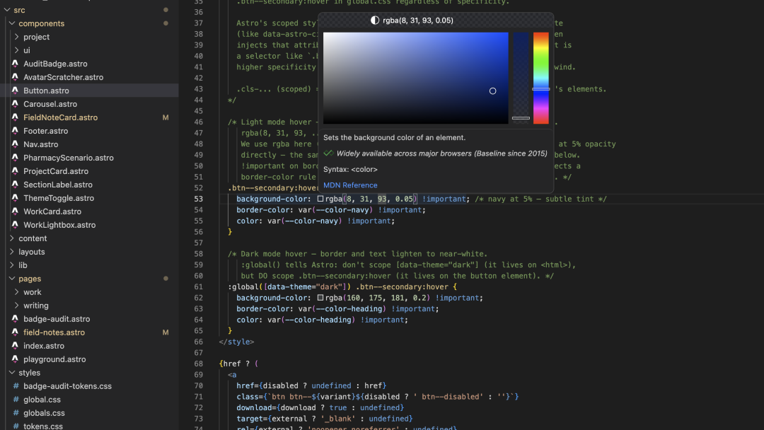
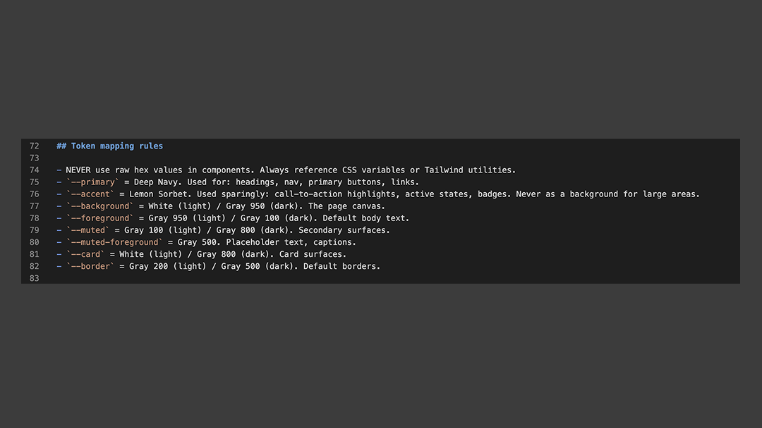
I documented all of this in a CLAUDE.md file at the root of my project. It tells Claude Code (and me, when I forget) which tokens to use, which files to read first, and what not to do. Never use a raw hex value. Never edit a Basis UI component without checking. Never add styles that already exist. The file is a design system brief written for an AI collaborator.
The playground as documentation
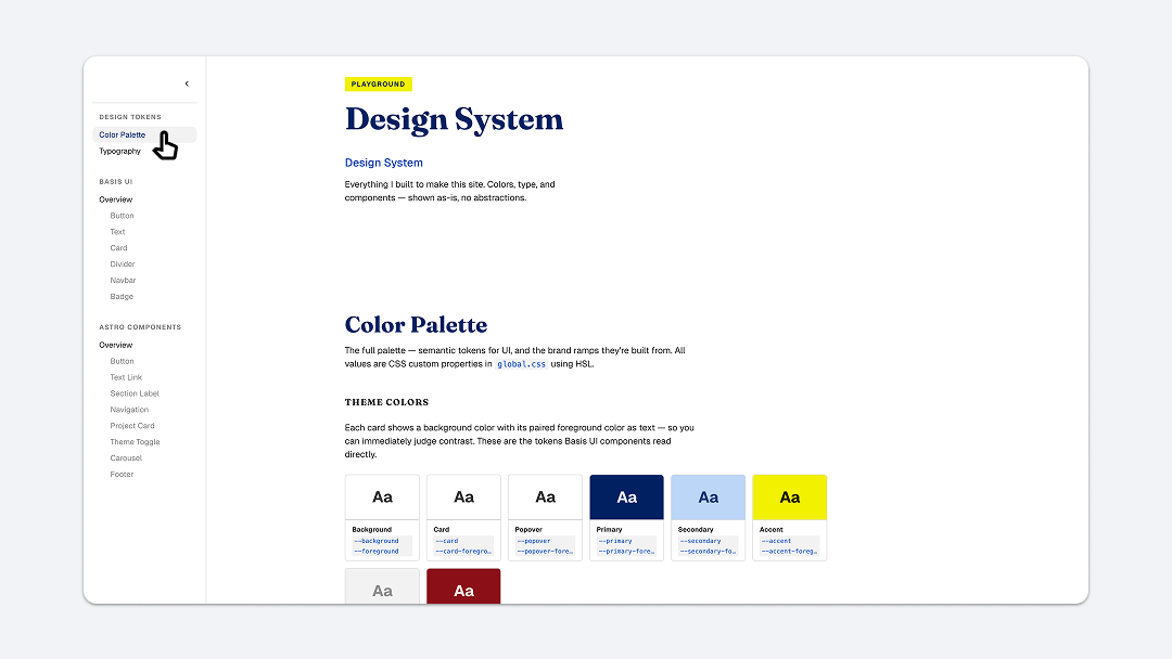
The playground page on my site is the design system itself, rendered live. Every color swatch is the real CSS variable. Every component example is the real component. When I toggle dark mode, the swatches update because they’re reading the same tokens the rest of the site reads.
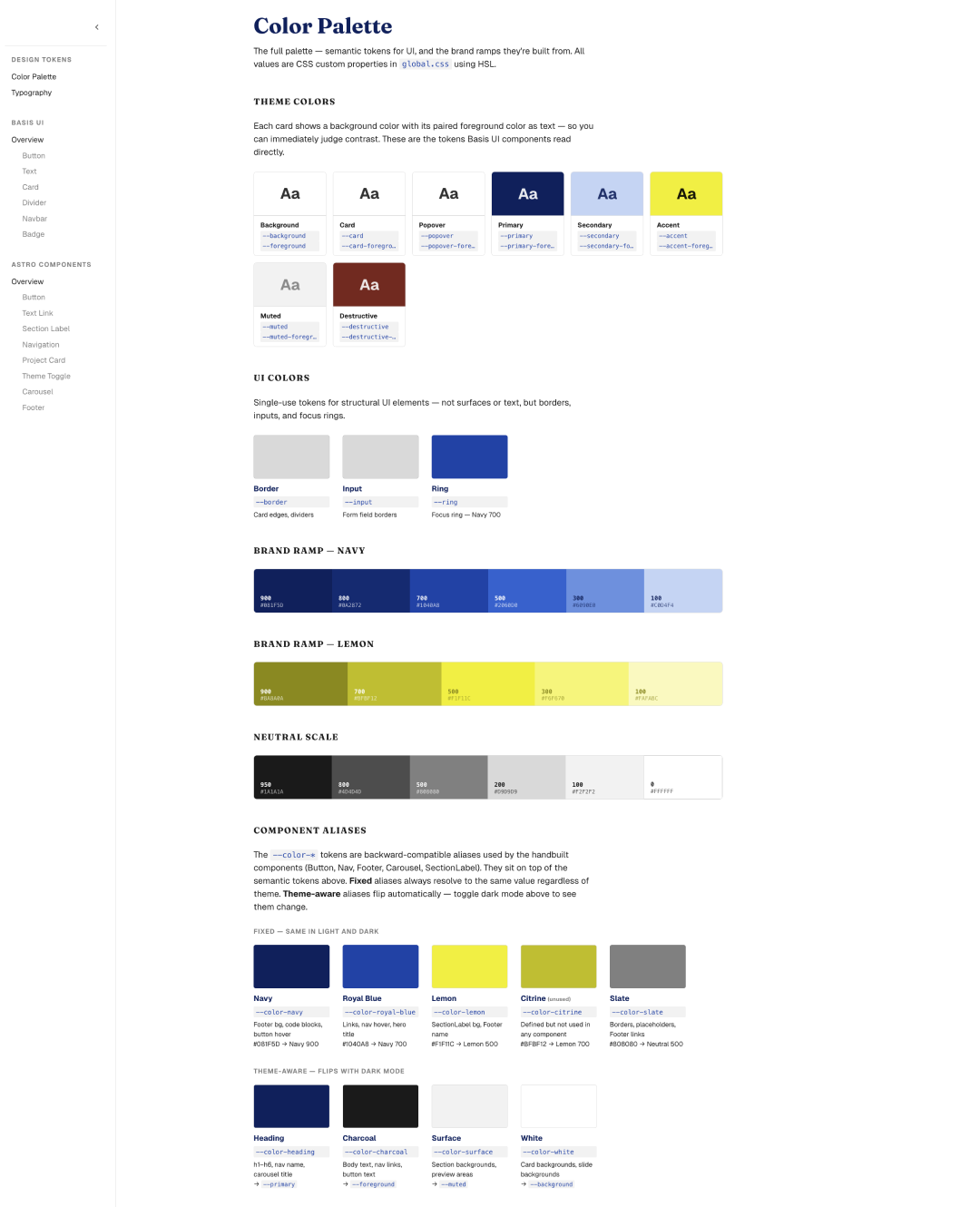
I organized it the way I’d want to read it: theme color pairs first (background with its foreground, so you can judge contrast immediately), then the brand ramps, then the components grouped by origin. Basis UI components on one side. Handbuilt Astro components on the other. Each one with a live preview and the import code.
What I noticed building it: the playground is where the two systems meet. The Basis UI components use the --primary, --secondary, --accent semantic tokens. The handbuilt components use the legacy --color-navy, --color-lemon, --color-charcoal aliases. Both systems resolve to the same underlying values. The playground makes that visible.
I also documented what the system intentionally excludes. Shadcn defines Chart 1 through 5, sidebar tokens, and several other groups. I don’t use them. Saying so explicitly prevents future me, or Claude Code, from adding them thinking they’re missing.
What I learned about AI and design systems
The most useful thing I built wasn’t a component. It was the CLAUDE.md file. When Claude Code reads that file before writing any code, it knows the project’s rules. It uses tokens instead of hex values. It checks whether a component exists before building one. It asks before modifying a shared file.
This is what “AI-native” means at the design system level. Not AI-generated components. Not an LLM that produces code from a prompt. A system where the rules are written clearly enough that an AI collaborator can follow them, and where the tokens are structured so generated code automatically inherits the right colors, spacing, and typography.
The Badge audit for my friend’s company taught me this backward. Their system was built for human designers who could see the color, pick the right Style, and apply it manually. An AI agent can’t look at a swatch. It needs a token name, a clear mapping, and constraints it can follow without interpretation. The same structure that makes a design system AI-ready also makes it better for humans: clearer naming, explicit roles, documented decisions.
I’m still learning. The playground page is cluttered in places and needs better organization. The legacy token layer should eventually collapse into the semantic layer. Some components need refactoring. These are the things I’ll keep working on as the site grows.
What I know now that I didn’t know when I started: a design system is a set of decisions, documented clearly enough that someone else can follow them. The “someone else” can be another designer, an engineer on the team, or an AI writing code at 2am while I sleep. The system works the same way regardless.
What’s next
This article documents what I’ve built so far. The next one will look forward: what design systems might look like when AI generates not just code but entire interface flows. That’s a different kind of design system, one that defines constraints and behaviors instead of components and tokens. I’m experimenting with this now, and I’ll write about it when I have something to show.
If you’re working on making a design system AI-ready, or if you’ve found tools and workflows that work, I’d like to hear about it. What’s working for you?
Marco Lobato · Turnform Design · marcolobato.info